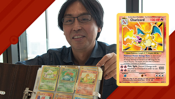
Even if you don’t recognize the name of artist Mitsuhiro Arita, you’ve almost certainly seen his work. He’s been illustrating Pokémon Trading Card Game cards for more than 20 years—ever since the very first cards were introduced in Japan in 1996. His art can be seen on more than 500 cards, including some of the most memorable cards in the history of the game. Mr. Arita’s legacy and impact on the Pokémon TCG—and on the world of Pokémon in general—is profound.
We recently had a chance to sit down with Mr. Arita in Tokyo. Though he typically works out of his home studio, he was kind enough to meet with us at the offices of Creatures Inc., the company responsible for development of the Pokémon TCG.
Like other artists who illustrate cards for the Pokémon TCG, Mr. Arita is not a full-time employee of Creatures, allowing him the freedom to work on many other projects as well. Mr. Arita says Pokémon has been the main focus of his artistic career, but he would never have guessed that would be the case when he began. In Japan, it took about a year for Pokémon to really take off after it debuted, so Mr. Arita essentially had no idea that Pokémon would be the global phenomenon it is now.
“When I first began working on the Pokémon Trading Card Game, I had no expectations I’d be working on it over 20 years later,” he says. Asked if he would he have charged a little more for his work had he known, he jokes, “Of course!”
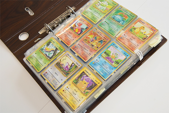
Mr. Arita came to the interview carrying an incredible testimonial to his experience with Pokémon: a thick binder containing every card he’s ever worked on.
“Going through it, I really have a lot of memories of these, and I really like all of them,” he says. There are 537 cards in the binder, organized in chronological order. Flipping through it is like watching a history of the Pokémon TCG.
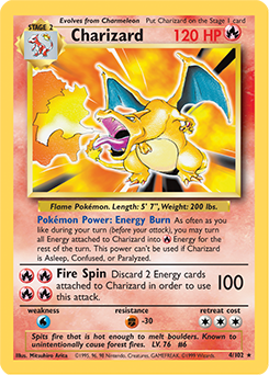 Mr. Arita’s long-lasting influence really hits home when the original Charizard and Pikachu from Pokémon TCG: Base Set appear in the first page of the binder.
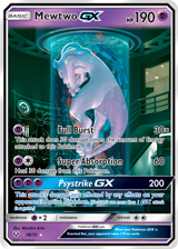
“I always thought that I’d probably never be able to draw cards that people liked as much as those two,” he says. “But I’ve gotten a lot of good feedback on a recent Mewtwo, so maybe there’s a chance!” He assures us that he doesn’t feel increased pressure when receiving assignments to draw these more famous Pokémon.
 A lot has changed in the 20 years since Mr. Arita began illustrating cards for the Pokémon TCG. He describes what it was like when he began—before the Pokémon TCG even launched.
“As you know, the first Pokémon video games came out on the Game Boy in monochrome, with a really rudimentary pixel art,” he says. “So when I started on this project, pretty much all I had as reference were those sprites—the pixel art of the Pokémon.” It’s safe to say that by creating his own artistic vision of these simple graphics, Mr. Arita contributed to how some Pokémon are portrayed today.
To make sure his artwork continues to resonate with Pokémon fans, Mr. Arita spends a decent amount of time playing the video games and watching the animated series. He admits that his busy schedule doesn’t always afford him time to finish every game, however. And, ironically, he doesn’t play the Pokémon TCG as much as he would like.
“I don’t really have any friends near where I live, so I don’t have a lot of chances,” he explains. “In the early days, when Creatures was a much smaller company and we were still just making the game, yeah, a lot of the time we would order a pizza after our meeting and play.”
To keep current with the look and feel of the Pokémon TCG, Mr. Arita studies and practices drawing Pokémon on an ongoing basis. He recognizes that one of his strengths is focusing on his own art style and not spending too much time seeing what other artists are doing.
“The Pokémon Trading Card Game has always been consistent in that their reason to have all these illustrators is to have a wide variety of styles, and to use the individual personalities of these artists,” he says.
Mr. Arita’s artwork creation process for the Pokémon TCG has also remained consistent over the years. He begins with a hand-sketched rough draft to set the scene, creating a few versions for Creatures to choose from. Once a general direction has been decided, he moves to a black-and-white line art version, and then to a full-color version that’s closer to the final product.
“Each of those three steps has its own check and approval process, which takes a decent amount of time,” he says. In total, accounting for all the planning, illustration, and approval phases, it takes about seven weeks just to create one piece of card art.
 Because he’s gained such strong knowledge of the brand over the years, Mr. Arita has a lot of liberty to illustrate Pokémon as he sees fit. But first, Creatures helps determine the setting and tone of the artwork. The work begins with a request for art for a particular card, as well as a little bit of information about what the studio wants to see in his illustration, such as a specific theme or location.
“For example, maybe they want a spot in the Alola region, and will maybe provide information about that place,” Mr. Arita says. “Also, sometimes Creatures will have a specific pose or attack in mind that they want me to do.”
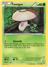 Mr. Arita takes care to give every illustration its own individuality: “One thing I always try to focus on in my illustrations is to think about what that Pokémon is, and to not think about what I’ve done with other Pokémon,” he says. This can be somewhat challenging for certain Pokémon, however. Pulling a Foongus from the large binder of his cards, Mr. Arita says that sometimes he has to work a little harder.
“This kind of Pokémon is really hard to pose. I tried to use my creativity to have it leaning against a tree to convey a softness of what the Pokémon is really like,” he explains. One thing he strives for with his Pokémon illustrations is give them a more realistic look. “I’ve always tried to observe reality and nature and try to reflect that when portraying the Pokémon as if they could be realistic creatures,” he says. A big part of this look is to also have a background that reflects realistic nature as much as possible.
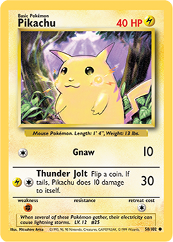 But Mr. Arita is aware of how Pokémon have changed over the years. While looking at his first drawing of Pikachu from Base Set, we commented that the famous Pokémon used to be much more rotund.
“Pikachu’s proportions kind of changed a bit, probably because of the animation. It would be difficult to show it moving around with those original proportions,” he explains. “But even when I’m drawing Pikachu to this day—if it’s not an action shot, I’ll kind of stick to the older design where it doesn’t have much of a neck. But in more movement-oriented scenes, I’ll draw it in a more modern style.”
A better understanding of trading cards as a medium has changed his style, too. He notes that older card illustrations were less detailed in the past, and not just in the Pokémon TCG.
“You can actually see this in other card games as well, like when you look at the older Magic: The Gathering expansions. The art was not...simple, exactly, but there wasn’t a lot going on in the scenes,” he says. “The more modern stuff is beautiful, but it’s just that it’s super detailed. I think a lot of fans appreciate the old style.” He attributes some of this change to improvements in technology—newer computers let artists add more detail than ever before. But when an image is shrunk to fit on a card, it can lose some of its impact.
“Sometimes I’ll even go back to my older, simpler designs and try to take learnings from those to keep that impact important,” Mr. Arita says.
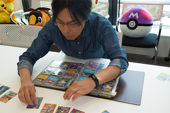
On the other hand, the emergence of full-art cards has allowed Mr. Arita and his fellow artists to add a little more detail than usual. Showing us a collection of recent rare Ultra cards he worked on, he explains that he was going for a specific look with them.
“I think as illustrators, we all try to creatively do this to make it feel like the art is even bigger than it actually is. So we spend time thinking about what will go out of the frame,” he says. “Or with the holographic cards, we think about which parts are going to sparkle and shine.” He notes that this runs contrary to what he was just saying about simpler cards having more impact, but it’s the larger and more complex art that gives him the freedom to try new things.
As Pokémon have changed in subtle ways, so has Mr. Arita’s technical approach. Advancements in computer technology have certainly aided his process, allowing him to work faster and on larger projects. He has always used a computer to color his illustrations digitally, but artwork larger than a card image was difficult.
“The power of computers was so weak then that if I had a big poster-sized illustration, I had to break it up into sections and color it while keeping in mind the other sections. So it was really a big pain to use computers back then. The improvements in technology have made it a lot easier,” he says.
Pokémon’s visual aesthetic, reminiscent of anime and manga, helps make the art easier to manipulate. Mr. Arita explains that it’s far easier to get the proportions right when working with a 2-D image than when working in 3-D. “As soon as they become 3-D models, where you have to care about proportions and everything, a lot of difficulties arise. It’s easy to draw hair standing up in 2-D, but as soon as it becomes a 3-D model, it’s challenging,” he says.
About his own work, Mr. Arita says, “I always try to do my best and leave the judgment and evaluation of the art to the future.” After 500 cards and more than 20 years of adding his creative vision to the Pokémon TCG, Mr. Arita can feel comfortable with his dynamic contributions to the Pokémon universe. We look forward to seeing his artistic creations in future expansions of the Pokémon TCG!
